Church Bulletin Design: 7 Checks Before You Print on Friday
The quickest test of church bulletin design is to hand a folded copy to someone who missed the planning meeting. Ask them where the children’s activity starts, which notice needs a response this week and whom to ask about transport. If they have to read every paragraph before answering, the bulletin may contain the right information in the wrong order.
A weekly bulletin has a different job from a church newsletter. Church bulletin design should help people follow this service and make their immediate next decisions. The newsletter can tell a longer story. Separating those jobs frees space for clearer type, better headings and fewer late corrections. This guide uses a four-page folded sheet, but the same tests work for one sheet or a phone edition.
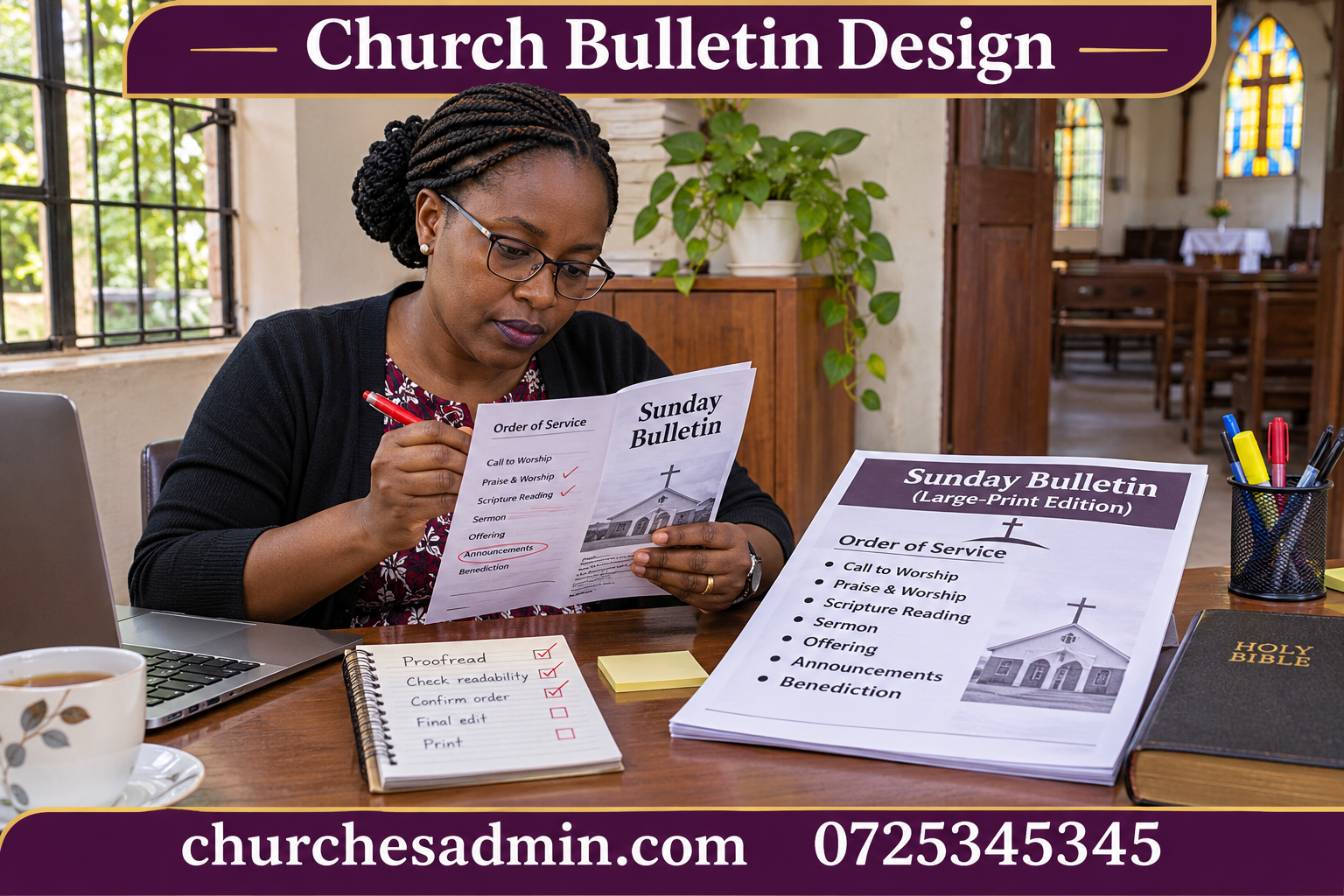
1. Start church bulletin design with a question for each panel
Fold a blank sheet before opening the design software. Number the pages in reading order. On the cover write: where am I and what is happening today? Inside left: how do I follow the service? Inside right: what needs my attention next? On the back: where do I find help or further information? Change these questions to suit your service, but do not begin with four equal boxes simply because the template offers them.
For a sheet printed on both sides and folded once, the outside spread commonly places the back beside the front; the inside spread holds the second and third pages together. Printer settings and fold direction matter. Make a physical dummy and run one test sheet through the actual printer. A church bulletin design viewed as four separate digital pages can conceal an upside-down reverse side or an incorrect panel order.
Give the cover enough information to identify this particular issue. Include the service date and site or branch if the church meets at more than one location. A visitor picking up last week’s copy should be able to recognise it immediately. A decorative photograph is optional; a readable date is not. Avoid printing a large theme line while hiding the location in small text below it.
2. Write notices for someone who has to act
Good church bulletin design gives each notice a clear purpose. A useful notice names the activity, audience, date, time, location, next action and contact. It does not need all seven fields when a field is irrelevant. A change to the meeting room may need only the affected group, date and new room. A workshop requiring registration needs the deadline and a route to register. Structure the sentence around what the reader must do.
Compare these two fictional notices. Before: “All members are reminded about the upcoming meeting and are encouraged to attend in good time.” After: “Choir rehearsal moves to the side hall this Thursday at 6 pm. Singers should bring the current music folder. If you cannot attend, tell the choir coordinator before Thursday afternoon.” The second version names the change and the people affected. Add the actual calendar date before publication so the notice remains understandable if someone forwards it later.
Ask the submitting ministry to check the revised wording. An editor can make a sentence clearer, but cannot authorise a new deadline or imply everyone is welcome if places are limited. Keep an approved copy of each time-sensitive notice. The church communication plan helps define who checks information and who sends corrections when details change.
3. Make the order of service easy to scan
Use the names and sequence approved by the service leader. Avoid filling the public bulletin with backstage cues. “Reading: [reference]” is useful to the congregation. A reminder to a technician about a microphone belongs in the team’s working copy. Decide when identifying a reader or leader helps and confirm permission and spelling before listing a name.
Consistent church bulletin design uses the same visual pattern for repeated items. An item heading can be bold, the reading reference plain and an instruction to the congregation clearly distinguished. Do not use three colours as the only way to explain three actions; the difference may vanish in a black-and-white copy. Test a photocopy if that is how many readers will receive the bulletin.
A long item title should wrap without making the next item look like part of the same instruction. Print one difficult example, such as a reading with a long reference and an unfamiliar speaker name. If the layout fails on that example, shorten or reorganise the text first. Reducing all the type to squeeze in one line makes every reader pay for a single editing problem.
4. Use church bulletin design to show priority
Choose one principal action for the week. It might be confirming attendance at a workshop before bookings close. Put that action near the top of the notices page with a short heading and the exact response route. An event several months away can sit in a short calendar list. Equal visual weight for both notices makes the urgent one easy to miss.
Agree with ministries how much space is available and when copy must arrive. Give a useful alternative when an announcement is too long. A bulletin can carry the date and essential action while the church newsletter provides the story behind the project. This protects the bulletin’s readability without telling a ministry that its work does not matter.
Before printing, cross-check upcoming items against the church calendar. A committee may approve a draft announcement before the room is confirmed. A repeated item may still use last term’s time. Ask the contact person to confirm the current facts; do not rely on the fact that identical wording appeared in an earlier issue.
5. Adapt church bulletin design for phones
A folded print sheet often becomes difficult to read when shared as a single image. Small text that looks fine on paper may require repeated zooming on a phone. Create a text version or a single-column page containing the same date, service outline and priority notices. Put headings in a sensible reading order rather than asking the reader to move between columns.
Keep the alternatives in sync by preparing one approved text source first. Build both editions from that source. If the workshop moves from one room to another, change the source and check both outputs. Two independently maintained versions create a predictable error: the printed bulletin says one thing, while the message sent on Saturday still contains the earlier location.
If you use a QR code, also print a usable alternative such as an office contact or short web address. Test the code on a real printout at its intended size. Ask where it leads, whether that page is current and whether a visitor must sign in unexpectedly. A code is useful when it saves effort; it should not become the only way to find information needed during the service.
6. Produce large print without simply enlarging a screenshot
Use the approved text to make a more spacious edition. Increase type size, allow lines to wrap naturally, use strong contrast and preserve the headings that help people find their place. Accept that the edition may need another page. Enlarging a photograph of the regular bulletin can produce fuzzy text without improving the reading order.
Offer the alternative in a way that lets people choose it comfortably. Tell ushers where copies are kept and how to identify the current version. Some people may prefer the phone text; others may prefer a printed copy with fewer items on each page. Ask a reader who uses the format what worked. A helpful answer might be as specific as “the time is easy to see, but I cannot find which hall.”
Use the church usher duties guide to connect the publication with the welcome at the door. An excellent large-print edition does little good if it stays in a locked office or if nobody knows it exists. Give the welcome team enough information to offer it without asking the visitor to explain a personal need publicly.
7. Run the Friday proof with two readers
Give the first reader a factual checklist: date, service time, venue, room, names, references, contact route and response deadline. Give the second reader a printed copy without that checklist. Ask them to find the main action and follow the service outline. The two readers test different things. A factually correct bulletin can still be hard to use.
Mark each correction against the approved source and produce a new proof. Do not make a last-minute edit on the print version alone. If the correction affects a phone edition or a public notice already scheduled, update those as well. Identify the person who releases the final version so that the printer does not receive two files both labelled final.
Keep a copy of the issued bulletin and its source with a clear date. For the next issue, copy the empty template rather than duplicating last week’s finished file whenever possible. If you must start from the previous issue, clear all dates and expired announcements first. This small habit prevents a surprising number of errors that otherwise survive a quick proofread.
A worked example: four panels for an ordinary Sunday
Imagine the cover contains the church name, branch, date, service time and a short welcome. Inside left contains the agreed order, with one reading reference and a short explanation for visitors. Inside right begins with the registration deadline for a training evening and follows with two confirmed activities. The back has office contact information and a note explaining where to find the phone edition.
Now a ministry submits a full page of highlights from last month. The editor offers a short line pointing readers to the longer newsletter feature. Another ministry sends a time change for an event already on the calendar. The editor gives that correction a more prominent position than the highlight because it changes what people need to do this week.
A visitor tries the proof and cannot tell whether the training evening is for everyone. The organiser clarifies that it is for current team leaders. The editor changes the heading to “Team leaders: register for Thursday training” and checks the phone edition. No extra panel is needed. The design improves because a more precise heading does the work that another paragraph would otherwise have done.
Review the issue after it reaches people
At the end of the service, ask the welcome team which questions they still had to answer. Separate questions caused by unclear wording from questions about information nobody supplied. If many people ask where the side hall is, a landmark may be more useful than a longer announcement. If people ask whether registration is required, rewrite the action line rather than enlarging the event title.
For teams coordinating dates and notices through ChurchesAdmin, identify the approved record from which the editor takes the final details. Keep publication dates and responsibility clear even if several volunteers take turns editing. The aim of church bulletin design is not to make every issue look different. It is to help someone arrive, participate and know what to do next without needing an insider to explain the page.
## A five-minute church bulletin design test
Take the final paper proof to the entrance where people normally receive it. Read the cover in the available light, unfold it while holding a bag and try to find the main notice without putting the sheet on a table. Then fold it back and check which contact details remain visible. A layout that reads comfortably on a designer’s large screen can behave quite differently in somebody’s hands.
Record one useful observation with the template: for example, “keep the registration deadline away from the centre fold,” or “put the branch name above the service date.” A specific note helps the next volunteer preserve a decision without having to rediscover the reason for it. Review these notes occasionally. If the printer, building or audience changes, the test matters more than preserving an old convention.
Keep the approved issue beside its print proof until Sunday has passed. If a visitor points out a discrepancy, the editor can establish whether the source, the printed copy or a later announcement needs correcting.
Other websites to explore
Additional websites: prim.co.ke, zama.co.ke, vega.co.ke, awasa.co.ke, saseni.com, jaat.co.ke, tas.co.ke, dereva.co.ke, zes.co.ke.