Church Banner Design: 7 Tests for a Readable Welcome Banner
A church banner design that looks balanced on a desk can disappear in a hall. The lettering may be hidden behind seated guests, a fold can cut through the church name, or a dramatic background can make the welcome message difficult to read. Before choosing colours, stand where the banner will be used and decide what a person should understand from that position.
A banner is not simply a larger poster. A poster can carry event details for a reader who stops close to it. A banner often identifies a place, welcomes people or directs them from a distance. The guide below focuses on that physical job, with a proofing process that a small church can use before committing money to printing or installation.
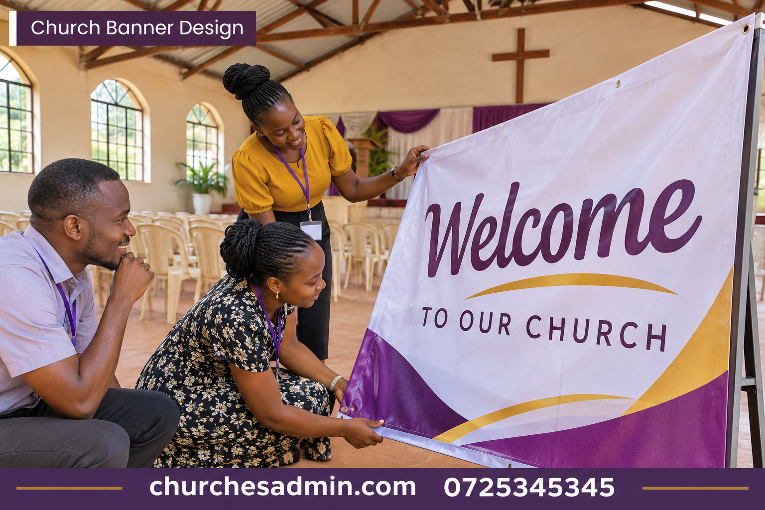
1. Give the church banner design one physical purpose
Choose between three common jobs: identify the entrance, welcome people inside or direct them to a particular activity. A single banner rarely performs all three well. An entrance banner needs a recognisable church name and perhaps a direction. A welcome banner inside the hall can use a short message. A directional banner needs an unambiguous destination and an arrow that points the right way when installed.
Write a one-sentence brief: “A person approaching from [location] should recognise [destination or occasion] before reaching [decision point].” This brief gives the committee a test for every proposed line of copy. A long theme may be meaningful but not necessary for finding the entrance. Put extra information in the programme or poster that people can read once they have arrived.
Visit the site during the type of gathering for which the banner is intended. Furniture, open doors and people can change the sightline. Photograph the view from the actual approach and note which part of the wall remains visible. A photograph of an empty hall taken from the stage may give a completely different impression from the view of an arriving visitor.
2. Measure the usable area and discuss installation
Record the available width and height, including obstructions, door movement and nearby fittings. Ask the venue contact what can be attached, where and by whom. A freestanding display, a wall-mounted banner and a suspended banner have different installation requirements. Have the venue and appropriate installer approve the method rather than assuming that a convenient rail or beam is suitable.
Ask the printer or installer which parts of the finished item are occupied by hems, pockets, stands or other fixing details. The printable rectangle in a design file may not be the visible rectangle after installation. Reserve space around the message so that an edge, fold or fitting does not obscure an important letter.
Check the route and setup time. A banner may fit on the wall but not through a narrow stairwell in its assembled form. Find out how it will be transported, stored, unpacked and installed. Use the church room booking guide to reserve access before the public event and allow time to remove the banner afterwards. Do not leave installation as an unassigned task for the first usher who arrives.
3. Write copy a moving reader can understand
Start with the church name or destination, then one message. “Welcome to [church and branch]” may be enough for an entrance. For a workshop, “Volunteer training — Side Hall” may be clearer than a theme that requires explanation. Use a date only when the banner is specific to one occasion. An evergreen banner becomes expensive to replace if it includes details that change every month.
Read the message aloud at walking pace. Ask a colleague to repeat it after looking for a few seconds. If they remember a decorative slogan but cannot name the destination, make the destination more prominent. If they can name the destination but do not know whether to turn left or right, the problem is the instruction or the placement, not the colour palette.
Keep supporting information at the appropriate scale. A full phone number or a long web address may be useful on an indoor banner read from nearby, but useless across a street. Avoid adding a QR code unless people can safely stop at the intended distance and the destination has been tested. Put detailed instructions in the church bulletin when that better suits the reader.
4. Test lettering, colour and the background together
Print a section containing the headline at its intended size. A small full-page proof can show composition but cannot tell you whether the actual letters are readable from the doorway. Place the sample near the intended location and view it from different approach angles. Check the lighting at the time the banner will be used, not only during an afternoon site visit.
Choose a background that supports the lettering. A photograph with alternating light and dark areas can hide different letters in different places. Try a solid panel behind the message or a quieter image. If the design depends on a thin outline around every letter, test whether that outline survives printing and any wrinkles in the material.
Do not rely on colour alone to separate a direction from a welcome message. A clear arrow, spacing and text hierarchy should still work in a monochrome proof. Test the approved church emblem separately. An intricate mark that is recognisable on stationery may need an approved simpler version for a banner. Use the correct artwork rather than tracing a low-resolution screenshot.
5. Compare materials for your church banner design
Ask suppliers to describe the finished product rather than only naming a material. Is it intended for the proposed indoor or outdoor setting? How is it installed and stored? What cleaning or handling does the supplier recommend? What finish and colour variation should the church expect from the proof? Request a sample or representative product where practical.
Distinguish the printed banner from the hardware used to display it. A church banner design quotation for a print alone is not comparable with one that includes a stand, fitting and delivery. Ask which components can be reused if the message changes and what replacement artwork would cost. A low initial price may lead to an avoidable second purchase if the display system cannot be used again.
Consider how often the church will move the banner. A permanent welcome message and a portable event display have different priorities. A product that looks impressive once may be inconvenient to pack and carry each week. Give the people responsible for setup a chance to handle the sample. Their experience belongs in the purchasing decision alongside appearance and price.
6. Approve the church banner design proof
Prepare an order specification containing the confirmed size, visible area, message, orientation, material, fixing method, quantity, delivery location and deadline. Attach the exact proof and identify who can approve a change. Avoid sending a printer several similar files and relying on the word final in the filename to settle which one should be produced.
Give one reader the wording and location facts, and another the physical specification. The first checks the church name, branch, event and direction. The second checks trim, folds, clear area and installation details with the supplier. Both should compare the same proof version. If the venue changes the installation position, repeat the direction and sightline checks before printing.
Follow the church budget planning guide to distinguish a quotation from an approved order. Ask for the total including agreed production, delivery and installation. Record any assumption about access or timing. A supplier should not have to discover on arrival that the banner must be installed in an occupied hall during another service.
7. Walk the route after installation
Once the approved installer has finished, view the banner from every intended approach. Check that the arrow points towards the actual destination, the message is not hidden by a door and people do not need to stand in a path of movement to read it. Ask a visitor unfamiliar with the building where they would go next. Their answer matters more than the committee’s memory of the layout.
Tell the church welcome team what the banner promises. If it says registration is in the side hall, volunteers should know the same location and the route there. If a change is necessary, use a clear temporary correction and brief the team. An attractive banner pointing visitors to an empty room is worse than an ordinary sign giving the right directions.
After the event, record whether people still asked for directions and from which approach. That information may reveal a missing second sign rather than a problem with the main design. Store reusable materials according to supplier guidance and label them with the intended location and orientation. The next volunteer should not need to reconstruct the setup from a photograph on a private phone.
Worked example: a reusable welcome or a dated event banner?
Imagine a church planning a one-day gathering followed by regular visitor services. Option A is a large event banner with the date and speaker. It communicates the occasion clearly but becomes outdated the next day. Option B is a reusable welcome banner with the church name, supported by a separate removable event notice. It can serve future gatherings but may need more than one printed item now.
The church banner design committee compares the quotes on the same basis, including mounting, transport and storage. It asks how many future uses are realistic rather than assuming a reusable product will automatically be used many times. If the venue and identity are stable, the second option may offer better value. If the event needs a distinctive message at a different venue, the first may better serve the actual purpose.
Write the decision as a practical statement: “We selected the reusable entrance banner because visitors will use this entrance at monthly services; the event name and date will appear on a separate notice.” That explanation gives the designer a useful brief and helps the next committee avoid printing a new large banner for every small change in programme.
Keep a church banner design and installation record
Save the approved proof, supplier specification, installation contact and one dated photograph of the final position. Note where the banner is kept and the condition in which it was returned. Keep any access or safety information within the appropriate venue process rather than treating the design file as installation guidance.
If your church uses ChurchesAdmin to coordinate events or rooms, connect the banner task to the confirmed venue and setup time. The value of church banner design is measured at the entrance: a visitor sees the right message, recognises the right place and continues without having to guess what the committee meant.
## A church banner design test for a change of entrance
Imagine a service normally uses the front entrance but a special gathering will use a side entrance. The existing church banner design welcomes visitors at the front without giving directions. Simply moving the banner to the side door may identify the destination once someone reaches it, but it does not help a visitor standing at the original decision point.
Walk the route from the usual arrival point. Decide where a temporary direction is needed and where the reusable welcome banner belongs. Test the arrow from the visitor’s perspective, not from the viewpoint of the volunteer hanging it. Ask whether the destination remains visible when the queue grows or a vehicle stops nearby. A second small direction sign can be more useful than increasing the size of the main banner.
Record the temporary arrangement and its removal time. After the gathering, return the permanent message to the correct location and remove the exceptional directions. A church banner design succeeds when it works across the whole arrival route. The printed object is only one part of that route, and an outdated arrow can undo the clarity of an otherwise well-made welcome.
Before filing the proof, write the viewing direction on its label. A future coordinator can then distinguish the banner intended for the main entrance from a similar design meant to be read from inside the hall.
Other websites to explore
Additional websites: prim.co.ke, zama.co.ke, vega.co.ke, awasa.co.ke, saseni.com, jaat.co.ke, tas.co.ke, dereva.co.ke, zes.co.ke.