Church Poster: 7 Practical Checks Before You Print or Share
A church poster has one advantage over an announcement made after a service: someone can take the details home. It also has one weakness: a person walking past cannot ask the poster a question. If the largest line says “You are invited” and the venue is hidden in a corner, the design has used its best space to say the least useful thing.
Start with a real job for the poster. A member might need to register for a workshop, a neighbour might want to attend a service, or a visiting choir might need directions. Those are different audiences and actions. This guide takes a single fictional workshop from the first request through print, mobile sharing and a last-minute room change. Replace every illustrative detail with information your church has approved.
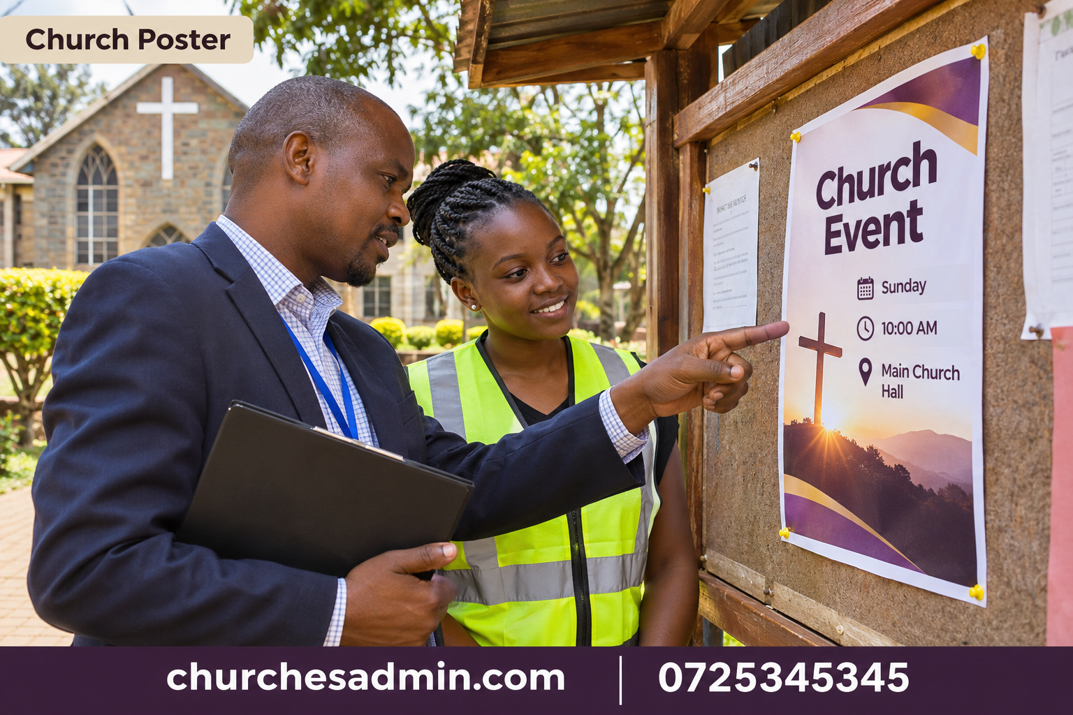
1. Write the church poster as five lines of information
Before opening a design tool, write the event name, the intended audience, the date and time, the venue and the next action. If any of those facts remains provisional, mark it in the working copy. A designer can solve a crowded page, but cannot decide whether a workshop is open to all members or limited to a nominated group.
Consider this fictional starting point: “Volunteer welcome workshop. For new and returning ushers. Saturday [full date], 9–11 am. Side hall at [church and locality]. Register with the office by [deadline].” The wording is plain enough for a reader to decide whether the event is relevant. A warmer line can follow if space permits. It should not displace the information needed to attend.
For each church poster, write down who can confirm each fact. The calendar coordinator confirms the date; the room coordinator confirms the venue; the organiser confirms the audience and response route. Check the church calendar planning guide when two activities share a building. An approved event date does not automatically confirm the particular room mentioned on the artwork.
2. Choose one church poster headline and one action
A church poster headline should help a person identify the occasion without reading the rest of the sheet. “Training for new ushers” tells a clearer story than “A special opportunity awaits.” If the occasion has a theme, put the theme below the descriptive headline unless the theme itself is already widely understood. Newcomers do not share all the context that regular members bring.
Choose the principal action. “Attend on Sunday” and “register by Thursday” are not interchangeable. If registration is required, say how to complete it and what happens next. If no registration is needed, avoid an unnecessary form. A contact for enquiries can sit below the main action rather than competing with it in equally large type.
Try the five-second test. Show the draft briefly to someone who did not organise the event, hide it and ask what it was for. Then show it again and ask what they would do next. Record what they actually say. If they remember the decorative background but not the workshop, the problem is hierarchy rather than a lack of enthusiasm from the reader.
3. Design for the distance at which people will read it
A noticeboard beside a doorway and a poster seen across a street require different levels of detail. Measure the actual viewing distance and print a sample at the intended size. Put it where it will be displayed and approach from the normal direction. A type size that looks bold on a laptop may become a thin grey line under a dim corridor light.
Use three levels of emphasis: an event headline, the date and venue, and supporting details. Keep related facts together. If the start time appears near the top but the venue is isolated at the bottom, the reader has to assemble the invitation from fragments. A short block of aligned text is often easier to scan than several coloured badges.
Check contrast without relying on colour alone. Print a black-and-white proof if the office may photocopy the poster. A pale headline on a patterned photograph can almost disappear. Move the words onto a solid area or choose a simpler image. Do not solve every legibility problem by making all the text bigger; remove a sentence that belongs in the longer invitation.
4. Prepare a mobile version of the church poster
A photograph of a finished print poster is rarely the best phone edition. It may include the edge of the noticeboard, glare or tiny body text. Export a clean mobile layout and accompany it with a short text message containing the event, date, venue and action. Someone forwarding the message should not need to retype the important information.
Assume the post may travel outside the original group. Replace “this Saturday” with the full date and “our hall” with the church name and locality. Do not publish a personal number merely because it was convenient in a planning conversation. Use the contact route approved for a public notice, and identify who checks messages received there.
For an invitation to another congregation, a poster may work best as an attachment to a church invitation letter. The letter can explain whether guests are invited to attend, speak or send delegates. Keep the public poster short while giving the receiving office the information it needs to respond accurately.
5. Check the image, names and permissions
Choose an image because it helps identify the occasion, not because it fills an awkward gap. A workshop for ushers might show a welcome team at an entrance. A generic photograph of a large crowd may imply a different event or scale. If the image is illustrative rather than a photograph from the church, do not caption it as evidence of a past gathering.
Confirm permission before using identifiable people, a guest’s portrait or another organisation’s artwork. Being invited to participate is not the same as agreeing to appear in publicity. A guest who is still considering the invitation should not be presented as a confirmed speaker. Ask the organiser to verify the name, title and agreed public role against the actual response.
Where a logo is used, obtain the approved file rather than copying a small social profile image. Check its placement after exporting. Fine details can blur when reduced or printed on inexpensive paper. Give it a clear area around it and resist enlarging it until it competes with the event name. The reader needs to identify both the host and the occasion.
6. Proof the church poster with two different jobs
Ask the first reader to check facts against the approved source: date and day, start and finish, audience, room, response deadline and contact. Ask the second reader to use the poster without prior knowledge. Can they decide whether they should attend, locate the building and explain the next action? These checks catch different kinds of mistakes.
Test a registration link or QR code from the printed proof, using the access a visitor would have. A link that opens for the organiser may lead another person to a sign-in screen. Provide a readable alternative where possible. For the mechanics of collecting an appropriate response, see the church event registration guide.
Give the approved file a clear name containing the event, date and version. Distinguish the print proof from the mobile edition. Record who approved the final facts and who sends the file to the printer. This prevents two volunteers independently distributing different versions after a late correction has been made in only one copy.
7. Plan for corrections and removal
Choose a person to maintain a small distribution list: which boards received the poster, which groups received the mobile version and which office holds the master. This is not a contact database for every individual who saw it. It is a practical map of where the host can issue an accurate correction.
Imagine the workshop moves from the side hall to the main hall after a printed batch is distributed. A corrected message should say “Room changed to the main hall” near the top, then repeat the event and date. Replace the printed copy or add a clear authorised correction. Let the church usher team know what to tell someone carrying the older version.
Remove or archive the church poster once the event ends. An old registration link looks current to someone who missed the date, especially when the year was omitted. Keep one approved example with the planning record. During the review, compare the questions received with what the poster said. If several people asked whether the workshop was for them, improve the audience line next time.
Worked example: rewrite a crowded invitation
The committee’s first draft reads: “All are warmly invited to our wonderful upcoming empowerment and service workshop with exciting sessions for everyone. Kindly plan to attend in large numbers.” The copy has energy but gives no immediate reason for a particular reader to act. More importantly, the organiser actually intends the session for those serving at the doors. “Everyone” creates the wrong expectation.
A stronger draft reads: “Welcome-team workshop. For current and prospective ushers. [Day, date and time]. [Church, hall and locality]. Bring the current welcome checklist. Confirm attendance with [office route] by [deadline].” A final sentence can explain the benefit: “Practise greeting visitors, answering questions and handing over concerns.” Now the invitation identifies both the audience and the useful work they will do.
The team tests it on paper and finds that the locality wraps onto a separate line below the registration deadline. They move the full venue together, shorten the heading and retain the deadline in its own action block. Nobody needs to redesign the event. A small editorial change has made the same facts easier to use.
A reusable church poster approval note
Copy this short note for the next issue: “Poster owner: [role]. Event and audience confirmed by: [role/date]. Venue confirmed by: [role/date]. Contact and registration route tested by: [role/date]. Image and names approved for: [print/mobile/public website]. Final version issued: [date]. Remove or replace after: [date].” Keep the note in the working file rather than putting it on the public poster.
Ask what approval means for each field. A person who confirms the room does not necessarily approve the guest photograph. A leader who approves the wording does not automatically check that a QR code opens on an unfamiliar phone. Splitting these jobs prevents a vague “looks fine” from being interpreted as a check nobody actually performed.
If you coordinate activity details through ChurchesAdmin, use one confirmed record as the source for the print and mobile editions. The test of a good church poster is not how many decorations it carries. It is whether a reader can decide, within a few seconds, what the occasion is, whether it is for them and how to take the next step.
## A church poster test for a second branch
Suppose the same workshop runs at two branches on different weekends. A single church poster listing both dates can be economical, but only if the reader can match each date to the correct venue. Put each branch, date, start time and response route in its own block. Do not put the two dates on one line followed by two addresses elsewhere and expect readers to connect them correctly.
Try two separate proofs with different volunteers. Ask one person when the first branch meets and the other where the second branch meets. If either gives the wrong combination, prepare two versions or simplify the layout. Name the files by branch and date, then ask the distribution owner to confirm which version goes on each board.
When one event is full, withdraw or revise only the affected edition. A short note saying “the workshop is full” can wrongly stop registrations at the other branch. Specify the branch, date and available alternative. This small example shows why a church poster needs to preserve context even when photographed, forwarded or read without its original caption.
Other websites to explore
Additional websites: prim.co.ke, zama.co.ke, vega.co.ke, awasa.co.ke, saseni.com, jaat.co.ke, tas.co.ke, dereva.co.ke, zes.co.ke.